Available
Webfont kit
Brand font files and licence documents.
Typography is like body language: a simple sign has a lot of hidden meaning. Typography is an identity by itself, and it should be treated delicately.
Available
Brand font files and licence documents.
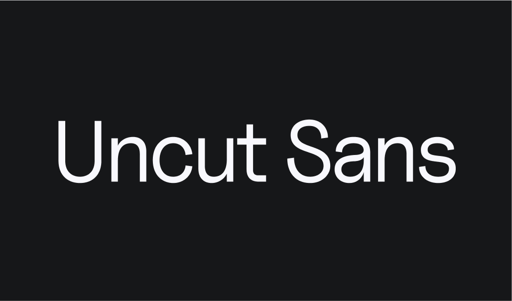
Uncut Sans is used for all large and medium headlines as well as body text. It's a neat and flexible font with modern features.
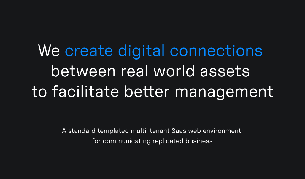
okUncut Sans in headline and subtitle.
okPrimary blue is used to highlight a phrase in the title.
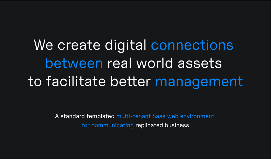
xDo not highlight words that are not connected within a sentence.
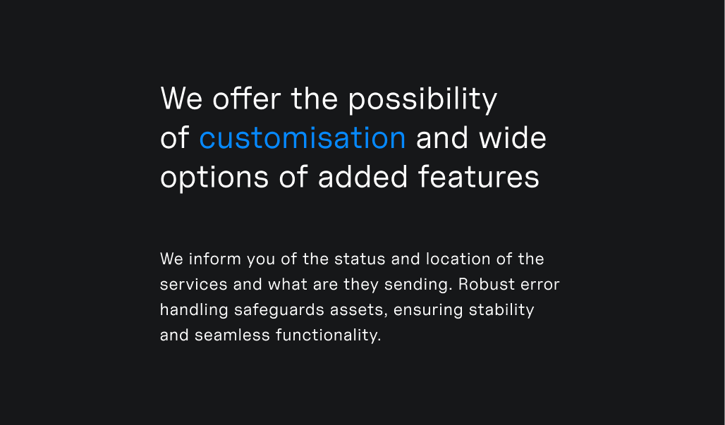
okIt's best to align longer body texts, more than one sentence, to the left. This helps with legibility.
okTitle is aligned to the left with the body text.
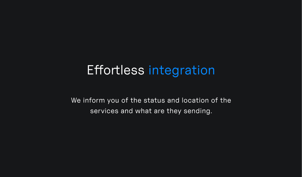
okTitle is center aligned with short subtitle.
okOne word is highlighted.
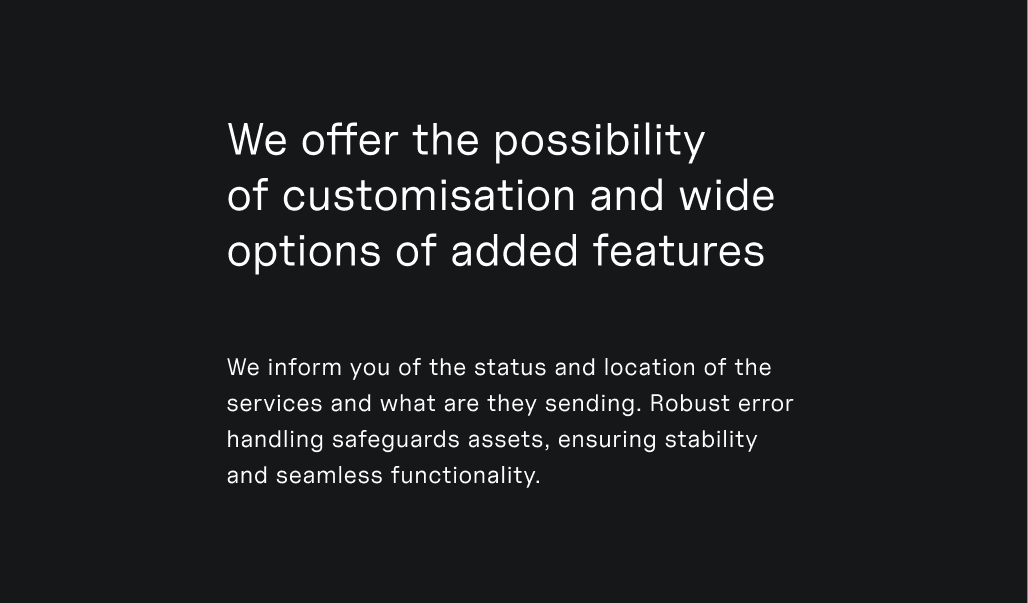
okIt's not necessary to highlight words or phrases in titles, they can also be fully white.
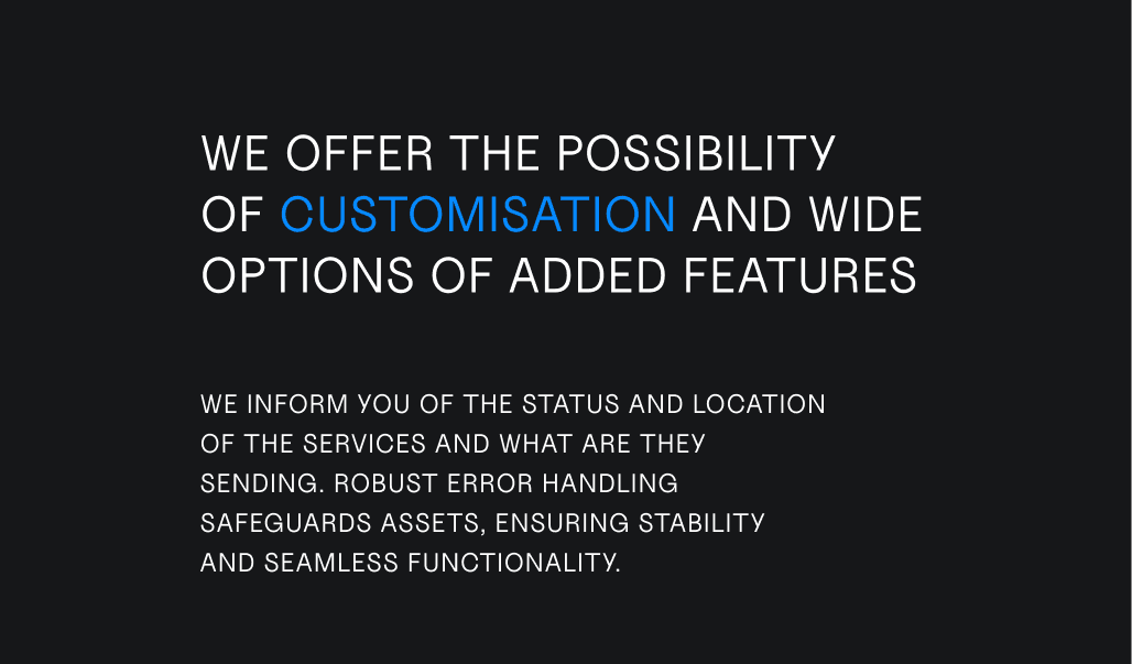
xText should never be in UPPERCASE, always in lowercase.
JetBrains Mono is used for small details, like buttons, short support titles or tags. The text should not be more than three words.
JetBrains Mono is always written in UPPERCASE with added space between letters, and always placed inside a rectangle with rounded corners.
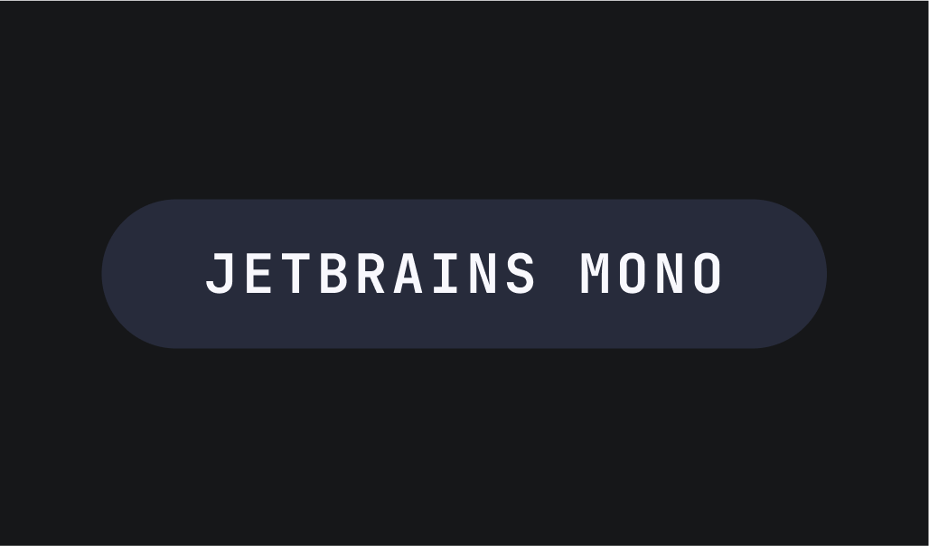
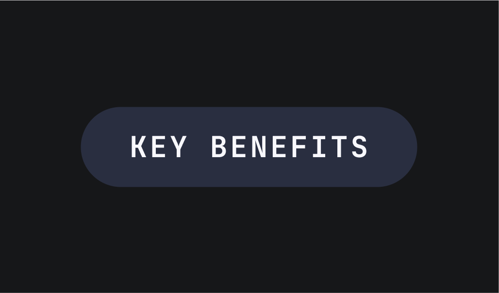
okIt's important to have correct spacing around the text when it's placed inside a stadium shape.
okThe space above and below the text should be the same as the text's height.
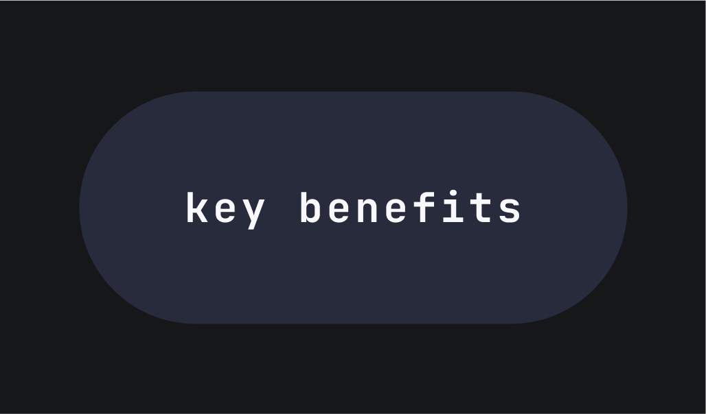
xThe space around the text is too big.
xJetBrains Mono should never be written in lowercase.
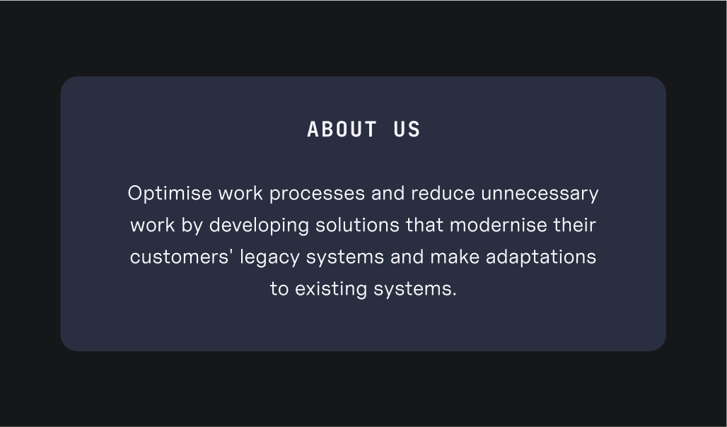
okJetBrains Mono can be used inside larger text boxes as a short title. In these cases it is not necessary to put it inside a stadium rectangle, the large text box serves the same purpose.
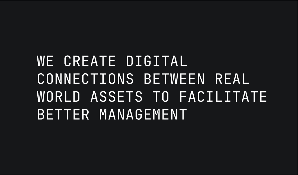
xJetBrains Mono should never be used in long sentences.
xJetBrains Mono should not be used without coloured rectangles.