Available
Colour files
Reference PDF for the primary Synia colour palette.
Colors are irreplaceable. They can sway thinking, change actions, and cause reactions. Used in the right way, they can communicate more than anything.
Available
Reference PDF for the primary Synia colour palette.
Synia is led by a dark primary palette, a clean light-mode palette, a focused blue accent system, and a small pastel set for numeric data.
Use the blue accent to highlight words, short phrases, patterns, and illustrations. Use pastel colours only for data visualisation and small details.
Choose a colour value button to copy its HEX and RGB values.
Primary black is the main dark background colour. Tints create hierarchy in text boxes, surfaces, and controls.
White mode is reserved for contexts where dark mode is not possible, such as Word documents.
Blue is Synia's primary accent colour. It highlights words, short phrases, patterns, and illustrations.
Pastel colours are only used for numeric data and small details.
Synia's brand is primarily black. Backgrounds are always in Primary black. We can create hierarchy in shapes, texts and buttons by using different black tints.
Primary black is the main background colour.
Black tints are used as background colour inside rectangles and for icons within rectangles.
White text on dark backgrounds.
Black tints should never be used as a primary background.
Do not mix dark backgrounds with light rectangles.
Do not mix black and white shades in text in a way that negatively affects legibility.

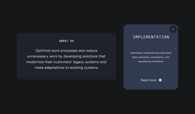
okPrimary black as a main background colour and black tints used as backgrounds for text boxes.
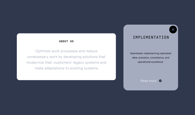
xDo not mix black and white elements together.
xDo not use black text on black backgrounds or white text on white backgrounds.
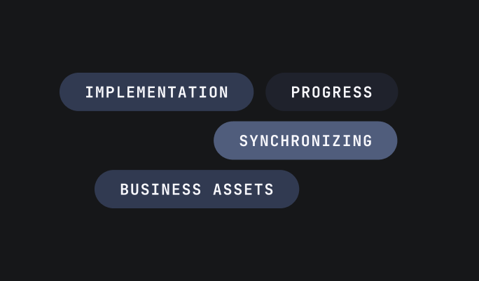
okBlack tints are used as background colour inside rectangles and for icons within rectangles.
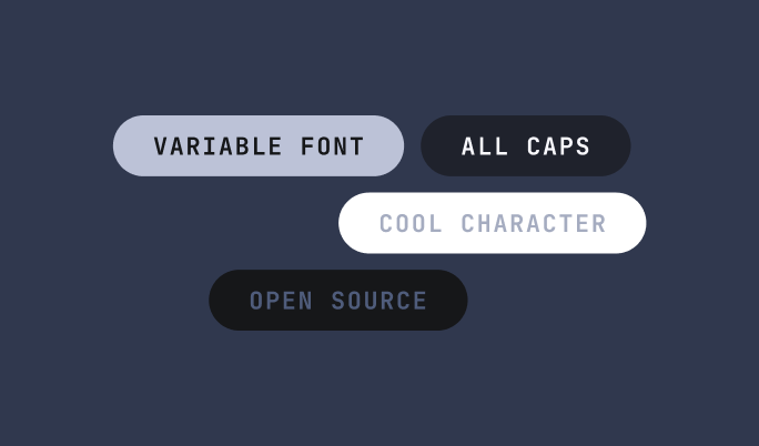
xBlack tints should not be used as a primary background.
White mode shoule only be used needed, when it is not possible to use dark mode, for example in Word documents.
The same rules apply to white mode and dark mode. Backgrounds are always in Primary white and we can create hierarchy in shapes, texts and buttons by using different white shades.
Primary white is the main background colour.
White tints used to create hierarchy in text boxes.
Do not use black tinted shapes on a white background.
Do not use white text on white backgrounds.
White shades should not be used as a main background.

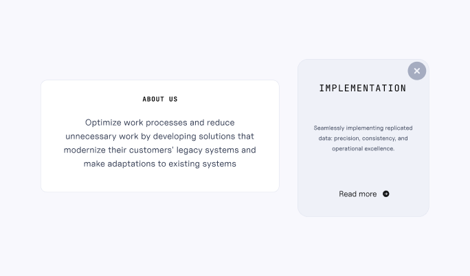
okPrimary white is the main background colour.
okWhite tints used to create hierarchy in text boxes.
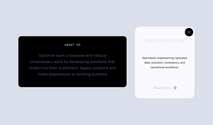
xDo not use black tinted shapes on a white background.
xDo not use white text on white backgrounds.
xWhite shades should not be used as a main background.
Blue is Synia's primary accent colour. It's used to highlight words or short phrases in titles and quotes as well as patterns and illustrations.
We use blue tints and shades to create a visual interest in patterns.
Primary blue is the main pattern colour.
Light and dark blue used in some dots to create more depth.
Blue pattern is on a Primary black background.

okPrimary blue is the main pattern colour.
okLight and dark blue used in some dots to create more depth.
okBlue pattern is on a Primary black background.

xPatterns should not be monochrome.
xPatterns should not be on tinted backgrounds.

okPrimary blue is used to highlight a phrase within a sentence.

xDo not use different shades of blue to highlight words, only Primary blue.
Paster colours are only used for numeric data on black or white backgrounds.
Pastel colours in a donut graph.
Text is white and data information is in a black tinted rectangle on a Primary black background.
Pastel colours can be used for small details, like progress bars on web.
Green is used to show a positive change.
Pastel colours should never be used in text.
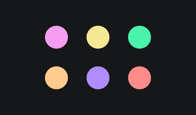
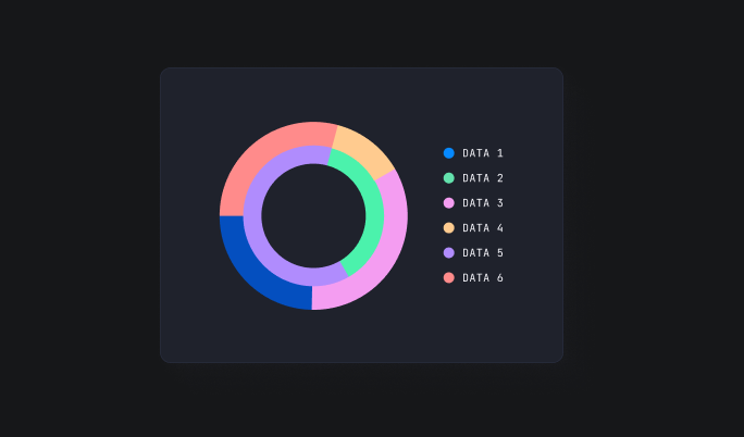
okPastel colours in a donut graph.
okText is white and data information is in a black tinted rectangle on a Primary black background.
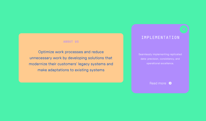
xPastel colours should never be used for primary backgrounds, rectangle backgrounds or text.

okPastel colours can be used for small details, like progress bars on web.
okGreen is used to show a positive change.

xPastel colours should never be used in text.